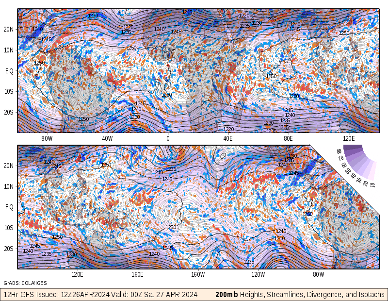
Thursday, July 29, 2010

Star Plots


Star plots allow you to compare different types of data for various experiments or designs. The radius of the star or design represents different characteristics. The center of the plot represents the most desirable result. This graph illustrates the fact that improvements in one metric often come at the expense of others.

Correlation Matrix


A correlation matrix is a square, symmetric matrix consisting of nothing but correlation coefficients. The rows and the columns represent the variables. The diagonal elements are all equal to 1, for the simple reason that the correlation coefficient of a variable with itself equals 1.

Similarity Matrix


A similarity matrix is a matrix of scores which express the similarity between two data points. This similarity matrix shows the relationship between enzymatic kinetic parameters and interaction fields.

Stem and Leaf Plot


A Stem and Leaf Plot is a type of graph that is similar to a histogram but shows more information. The Stem-and-Leaf Plot summarizes the shape of a set of data and provides extra detail regarding individual values. Stem and Leaf Plots are great organizers for large amounts of information. This stem and leaf plot shows the bus schedule for the Redwood Transit System. The hour is the leaf and the minutes are the leaves.

Box Plot


Box plots, also known as box-and-wisker diagrams, are useful in comparing multiple sets of data because they display the median, the average, and the level or measurement of dispersion. This box plot depicts the distribution of flight delays by date.

Histogram


Histograms are a bar graph of a frequency distribution in which the widths of the bars are proportional to the classes into which the variable has been divided and the heights of the bars are proportional to the class frequencies This histogram is in paraview.

Parallel Coordinate Graph


Parallel coordinate graphs display multiple data on one graph. Each variable is plotted on a vertical axis. Parallel coordinate graphs can also be used to compare data of different variables. This graph is used to  help biologists to understand the relationship between gene expression patterns in three dimensions. The graph illustrates a 3D parallel coordinate view of all cells and nine selected genes.

Triangular Plot


A triangular plot is graph that displays three types of data. Because there is three varibles of information mapped, it is presents the graph as a triangle. This graph illustrates the percentage of conservitive, liberal, and labour votes in the United Kingdom. The dot in the graph is the percentage of expected votes based on the polls.  

Windrose


A wind rose can either be a map symbol showing, for a given locality or area, the frequency and strength of the wind from various directions, or a diagram showing the relation of wind direction to other weather conditions at a given location.

Climograph


A climograph is a graph of monthly average temperature plotted against average humidity. The monthly points are joined by a line. The shape and location of line indicates the nature of climate in terms of heat and humidity. This is a climograph of Quebec City.

Population Profile


This population profile illustrates the percentage of change in population in Georgia from 1990-2000. A population profile can be based on a population distribution. A population distributions is the arrangement or spread of people living in a given area; also, how the population of an area is arranged according to variables such as age, race, or sex.

Saturday, July 24, 2010

Scatter Plot


A scatter plot is a pictorial way of representing data to see if there is a relationship between two sets of measurements. This scatter plot is a scatter plot of the parameters salinity,chlorophyll-a, oxygen saturation index and pH on the route Cuxhaven-Harwich in the year 2005.

Index Value Plot


In an index value plot, an index value is plotted instead of an actual number. An index value, not an absolute value, is plotted on a line graph. This graph shows the gasoline prices in parts of Canada between 1998 and 2009

Lorenz Curve


The Lorenz Curve is used to discuss concentration of suppliers, or firm, in a market. The horizontal axis is divided into as many pieces as there are suppliers. On the vertical axis are the market sales in percentage terms from 0 to 100. The Lorenz curve is a graph of the sales of all the firms to the right of each point on the horizontal axis.

Bilateral Graph


A bilateral graph displays both positive and negative data representation against a zero line. This graph illustrates how U.S. exports to Europe have moved with the exchange rate.

Nominal Area Choropleth Map


Nominal area choropleth maps present qualitative classification into groups and portrays no implicit ordering. As visually displayed above, ungraded colors are often used in nominal maps since the observer is strictly interested in having the ability to distinguish between classes.

Unstandardized Choropleth Map


An unstandardized choropleth map is one that has not been areally averaged by density or percentages. It uses no raw numbers. This map displays state distribution.

Standardized Choropleth Map


Standardized choropleth maps are maps where the data is areally averaged. Areally averaged data can be presented in many different ways such as densities or percentages. This map is a standardized choropleth map that illustrates population density of the United States. This map is based on the 2000 Census.

Univariate Choropleth Map


Univariate choropleth maps measure one variable/data set cartographically. This map illustrates the population density in New England in 2000.

Bivariate Choropleth Maps


A bivariate map displays two variables on a single map by combining two different sets of graphic symbols or colors. This map shows what states the Gateway to College is located in.

Unclassed Choropleth Map


Unclassed choropleth maps are choropleth maps on a much larger scale and do not show as specific data as a classed choropleth map. Unclassed choropleth can have no boundaries or no numerical value. The scale for an unclassed choropleth map is a continuous grading of color, with each color representing a specific value. This map shows the election results from the 2006 election in Catalonia, Spain.

Classed Choropleth Map


A classed choropleth portrays varying statistics that occur within specified boundaries. The map above  is based on a cover change analysis carried out by Ecosur and Conservation International. The colouring helps to point out “hotspots” of forest cover change in the percentage of total land area in each municipality.

Range Graded Proportional Circle Map


In range-graded proportional circle maps the data is divided into groups using classification procedures common to choropleth mapping. This map illustrates the radius of action of a modern zeppelin.

Continuously Variable Proportional Circle Map


A continuously variable proportional circle map is a proportional circle map which utilizes circles to create point data. This relates the scales to the specific data. The circles are in proportion to the variable being measured. In this map, the circles represent the major industries in West Germany.

DOQQ Map


A Digtal Orthophoto Quarter-Quadrangle, or DOQQ, combine the image characteristics of an aerial photograph with the geometric qualities of a map. A DOQQ is basically an aerial photograph that has been georeferenced and orthorectified. This map is a DOQQ of forest density.

DEM Map


A digital elevation model, or DEM, is a digital file consisting of terrain elevations for ground positions at regularly spaced horizontal intervals. This map illustrates the money contributed as a proxy for votes between Democrats, Rebulicans, and neutral voters. It shows which party dominates different areas of the country. The darker the color, the more of a landslide it was for the winning party.

DLG Map


A digital line graph, or DLG,are files that are digital vector representations of cartographic information. Data files of topographic and planimetric map features are derived from either aerial photographs or from cartographic source materials using manual and automated digitizing methods.

DRG Map


A digital raster graphic, or DRG, is a scanned image of a USGS standard series topographic map, including all map collar information. This map is an illustration of avalanche paths in the Mt. Shuksan and Heather Meadows Basin.

Isopleth Map


A isopleth is a line on a map connecting places registering the same amount or ratio of some geographical or meteorological phenomenon. An isopleth is also called a isogram isoline. This illustration is a bivariate color symbolization. Color bivariate isolines can be created by changing the current line's color and drawing a second isoline coverage. Color, bivariate fishnets can be generated by hue shading a surface.

Isopach Map


A isopach map is a map of the areal extent and thickness variation of a stratigraphic unit. They are used in geological exploration for oil and for underground structural analysis. This map is an illustration of the 1815 Mount Tambora eruption. The red areas are maps of the thickness of volcanic ashfall.


Isohyetal Map


An isohyet is a line joining points of equal precipitation on a map. A map with isohyets is called an isohyetal map. This map is an illustration of percepitation levels measured at different rain gauge locations.

Isotachs Maps


An isotach is a line on a weather map or chart connecting points where winds of equal speeds have been recorded. This map is 850mb Streamlines/Isotachs. It is demonstrating a 12 hour GFS forcast over the tropics.

Isobars


Isobars are lines that connect points of equal atmospheric pressure on weather maps. Isobars are similar to height lines on a geographical map, and they are drawn so that they can never cross each other. Meteorologists use isobars on weather maps to depict atmospheric pressure changes over an area and to make predictions concerning wind flow. This map is a moving weather map. It shows up-to-date pressures and temperatures over northern Europe.

Friday, July 23, 2010

LIDAR


Light Detection And Ranging, or LIDAR,  is an optical remote sensing technology that measures properties of scattered light to find range and/or other information of a distant target. This map is an example of hillshade.

Doppler Radar


A Doppler radar is a specialized radar that makes use of the doppler effect to produce velocity data about objects at a distance. Doppler photos are created by sending out microwave signals toward an object, then watching to see how the signals bounce off the object and analyzing them. This was a dopplar image from 1/17/10 at 2:04am.

Black & White Aerial Photo


Aerial photos can provide valuble information on landscapes, terrain, and other neighboring structures. NASA and other agencies use aerial photos for research and to test remote sensing techiques and instruments.

Infrared Aerial Photograph


Infrared film and infrared digital sensors are sensitive to a certain portion of the spectrum of light, and by careful filtration, processing and selection of films, infrared aerials can provide invaluable information. It can be used to document changes to the environment, the health of forests, wetlands, bays and oceans. This picture is of Mitchells Cut in Texas. Mitchells Cut is a natural cut that connects East Matagorda Bay with the Gulf of Mexico.

Cartographic Animations


Cartographic animation is the application of animation to add a temporal component to a map displaying change in some dimension. This map, when in motion, uses cartographic animation to illustrate the path of a hurricaine across Florida. Weather forcasters use cartographic animation during each weather forecast to show us where inclimate weather can be expected.

Statistical Map


A statistical map, or also known as a distribution map, is a graphic representation of elements of importance or interest pertaining to a theme, such as the geographic occurrence of an item, feature, or event

Cartogram


A cartogram map in which some thematic mapping variable is substituted for land area. The geometry or space of the map is distorted in order to convey the information of this alternate variable. This cartogram illustrates the number of plant species categorized by country.

Flow Maps


Source:
Direct link to map:
A flow map shows the movement of objects from one location to another. Flow maps can also be used to illustrate step by step instructions. This flow map is an illustration of the way in which the people of Leicestershire use the library services

Isoline Map


An isoline map is a map with continuous lines joining points of the same value. This Isoline map is an illustration of the levels of percipitation and specific monitoring sites. These sites are represented by the circles.

Thursday, July 22, 2010

Proportional Circle Map


A proportional circle map is a type of thematic map that presents the data in the form of circles proportional to the size of the unit being measured. A small circle would indicate a small value, and a large circle indicates a higher value. This map uses different colors to represent different areas of the world. It then illustrates the life expectancy of people at an average income level for that area of the world.

Choropleth Map


Choropleth maps display different statistical values for a variable in different colors or patterns. This map compares the Department of Transport measured road lengths by English county, and comparing them with the total lengths of roads in OpenStreetMap.

Dot Distribution Map


Dot Distribution Maps, also called Dot Density Maps, use small dots to represent some statistical data characteristic about a particular area. This map illustrates children ages 5-17 by census block for the northern New Castle County school Districts. One dot per 5 kids.

Propaganda Map


Propaganda maps are often used by the government, to influence the general public of a certain idea. They manipulate what might be real and shape it into something that will lead an individual to feel a certain way about the topic at hand. This map illustrates the Red Army's spreading influence over central Europe.

Hypsometric Map


A hypsometric map is a map giving elevations by contours, or sometimes by means of shading, tinting, or batching. This map is illustrating travel times from Cambridge to outlying areas or cities. Red is the fastest travel routes and blue is the slowest.

PLSS Map


A Public Land Survey Systems (PLSS) map is used by the United States government to divide areas of public domain. This was established in the Land Ordinance of 1785. The Land Ordinance of 1785 divided lands into 6 sqare mile townships. These divided sections can then be divided again in to sub-sections and so on.

Cadastral Map


A Cadastral Map is a map in which metes and bounds are used to establish property lines.  This is illustrated by defined areas usually portrayed with numbers signifying ownership or tenure. These can be residential, local, or national.

Wednesday, July 21, 2010

Thematic Map


This is a thematic map of the Paris region. This map shows where someone could find business parks, transportation, hotels, and economic centers. Thematic maps are maps that focus on illustrating specific ideas or themes.